SKEDSOFT
Introduction: A side from the bar charts, pie charts, and line graphs used in most statistical or graphical data presentation software packages, there are other popular types of graphs for the display of data summaries and distributions. These include histograms, quantile plots, q-q plots, scatter plots, and loess curves. Such graphs are very helpful for the visual inspection of your data.
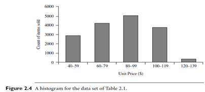
Plotting histograms, or frequency histograms, is a graphical method for summarizing the distribution of a given attribute. A histogram for an attribute A partitions the data distribution of A into disjoint subsets, or buckets. Typically, the width of each bucket is uniform. Each bucket is represented by a rectangle whose height is equal to the count or relative frequency of the values at the bucket. If A is categorical, such as automobile model or item type, then one rectangle is drawn for each known value of A, and the resulting graph is more commonly referred to as a bar chart. If A is numeric, the term histogram is preferred. Partitioning rules for constructing histograms for numerical attributes are discussed in Section 2.5.4. In an equal-width histogram, for example, each bucket represents an equal-width range of numerical attribute A.
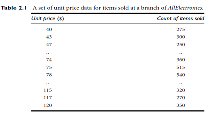
Figure 2.4 shows a histogram for the data set of Table 2.1, where buckets are defined by equal-width ranges representing $20 increments and the frequency is the count of items sold. Histograms are at least a century old and are a widely used univariate graphical method. However, they may not be as effective as the quantile plot, q-q plot, and box plot methods for comparing groups of univariate observations.
A quantile plot is a simple and effective way to have a first look at a univariate data distribution. First, it displays all of the data for the given attribute (allowing the user to assess both the overall behavior and unusual occurrences). Second, it plots quantile information. The mechanism used in this step is slightly different from the percentile computation discussed in Section 2.2.2. Let xi, for i = 1 to N, be the data sorted in increasing order so that x1 is the smallest observation and xN is the largest. Each observation, xi, is paired with a percentage, fi, which indicates that approximately 100 fi% of the data are below or equal to the value, xi. We say “approximately” because
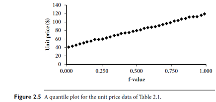
there may not be a value with exactly a fraction, fi, of the data below or equal to xi. Note that the 0.25 quantile corresponds to quartile Q1, the 0.50 quantile is the median, and the 0.75 quantile is Q3.
These numbers increase in equal steps of 1=N, ranging from 1=2N (which is slightly above zero) to 1-1=2N (which is slightly below one). On a quantile plot, xi is graphed against fi. This allows us to compare different distributions based on their quantiles. For example, given the quantile plots of sales data for two different time periods, we can compare theirQ1, median,Q3, and other fi values at a glance. Figure 2.5 shows a quantile plot for the unit price data of Table 2.1.
A quantile-quantile plot, or q-q plot, graphs the quantiles of one univariate distribution against the corresponding quantiles of another. It is a powerful visualization tool in that it allows the user to viewwhether there is a shift in going fromone distribution to another.
