SKEDSOFT
Introduction: ROC curves are a useful visual tool for comparing two classification models. The name ROC stands for Receiver Operating Characteristic. ROC curves come from signal detection theory that was developed during World War II for the analysis of radar images. An ROC curve shows the trade-off between the true positive rate or sensitivity (proportion of positive tuples that are correctly identified) and the false-positive rate (proportion of negative tuples that are incorrectly identified as positive) for a given model.
That is, given a two-class problem, it allows us to visualize the trade-off between the rate at which the model can accurately recognize ‘yes’ cases versus the rate at which it mistakenly identifies ‘no’ cases as ‘yes’ for different “portions” of the test set. Any increase in the true positive rate occurs at the cost of an increase in the false-positive rate. The area under the ROC curve is a measure of the accuracy of the model.
 In order to plot an ROC curve for a given classification model, M, the model must be able to return a probability or ranking for the predicted class of each test tuple. That is, we need to rank the test tuples in decreasing order, where the one the classifier thinks is most likely to belong to the positive or ‘yes’ class appears at the top of the list. Naive Bayesian and back propagation classifiers are appropriate, whereas others, such as decision tree classifiers, can easily be modified so as to return a class probability distribution for each prediction. The vertical axis of an ROC curve represents the true positive rate. The horizontal axis represents the false-positive rate. An ROC curve for M is plotted as follows. Starting at the bottom left-hand corner (where the true positive rate and false-positive rate are both 0), we check the actual class label of the tuple at the top of the list. If we have a true positive (that is, a positive tuple that was correctly classified), then on the ROC curve, we move up and plot a point. If, instead, the tuple really belongs to the ‘no’ class, we have a false positive. On the ROC curve, we move right and plot a point. This process is repeated for each of the test tuples, each time moving up on the curve for a true positive or toward the right for a false positive.
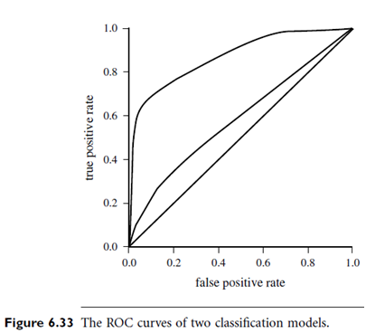
Figure 6.33 shows the ROC curves of two classification models. The plot also shows a diagonal line where for every true positive of such a model; we are just as likely to encounter a false positive. Thus, the closer the ROC curve of a model is to the diagonal line, the less accurate the model. If the model is really good, initially we are more likely to encounter true positives as we move down the ranked list. Thus, the curve would move steeply up from zero. Later, as we start to encounter fewer and fewer true positives, and more and more false positives, the curve cases off and becomes more horizontal.
To assess the accuracy of a model, we can measure the area under the curve. Several software packages are able to perform such calculation. The closer the area is to 0.5, the less accurate the corresponding model is. A model with perfect accuracy will have an area of 1.0.
